Choosing who looks after your money.
In many traditional banks, clients have little or no possibility to choose their financial advisor. This project turns that gap into a guided, informed choice, for people who know exactly what they need and for people who don’t yet.
- Role
- UX/UI design, end to end
- Sector
- Financial services
- Scope
- Domain analysis, flows, IA, UI
- Focus
- Trust and decision-making
- Tools
- Figma
Why
The project started from a personal need. In many traditional banking contexts the advisor is assigned, not chosen, so the most important relationship in someone’s financial life begins without any say from them.
Goal
Turn the complexity of financial advisory into a clear, guided and informed choice. The project combines informational content, orientation tools and a structured search, and it had to work for two very different people: the one who already knows what they want, and the one who is unsure where to start.
Home: introduce, then let people search
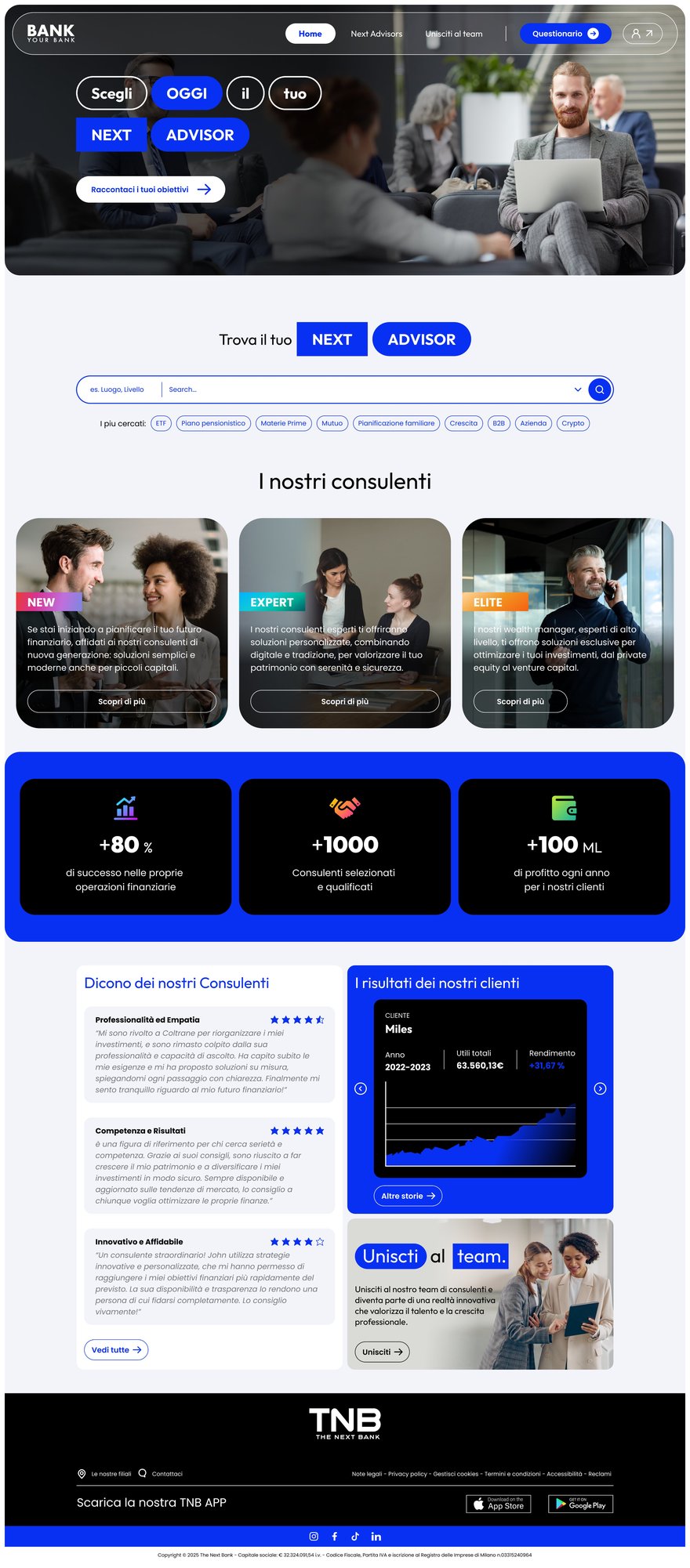
The home page has two jobs: introduce the service and act as the gateway to the search.
Search first
The main action, finding an advisor, sits right under the value proposition.
Two paths
Start searching immediately, or scroll to learn about advisor types, the benefits and how selection works.
No interruption
A search started here continues seamlessly in the dedicated search flow.
Different mindsets
It balances exploration and conversion without forcing one path.
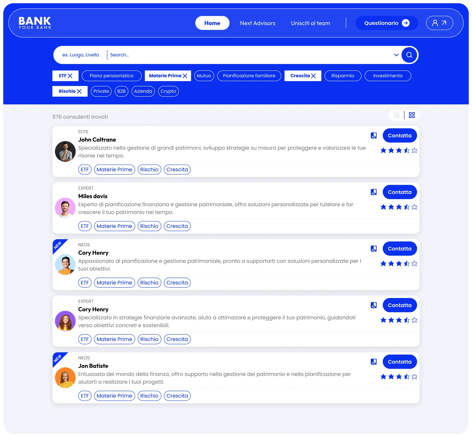
Search: from intent to a shortlist
The search is where the choice happens. It has to let people identify and compare advisors on criteria that matter to them, and leave them confident in the decision.
Intent-driven filters
Filters reflect real needs, such as a pension plan, a mortgage or growth, not technical or abstract data.
Progressive refinement
Start broad and narrow down step by step, to keep the cognitive load low.
Comparable results
Every advisor appears in the same structure: level, specialisations, rating, contact. Easy to scan and shortlist.
Control
Filters can be changed at any moment without starting over.
Help for the unsure
A questionnaire translates personal needs into concrete search parameters.
Advisor profile: the moment of trust
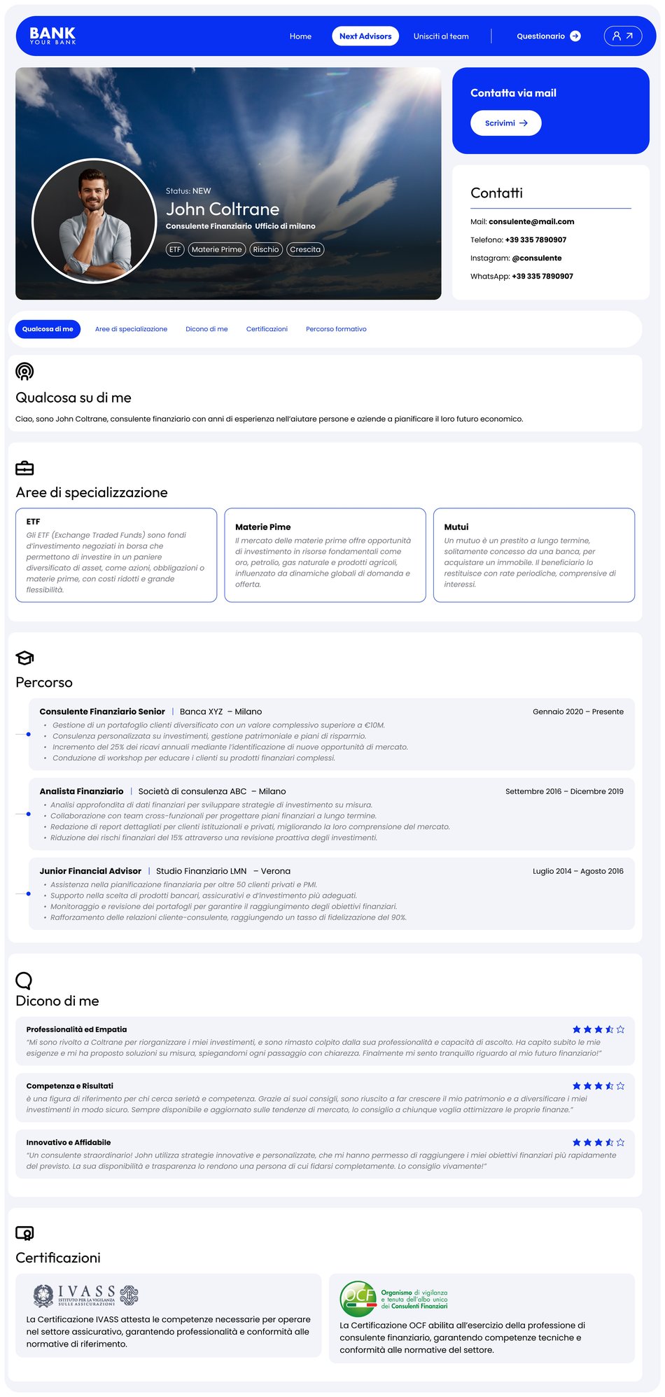
The profile supports the final step of the decision, with clarity, reassurance and transparency.
Clear overview
Role, expertise and specialisations at a glance.
Trust before detail
Experience, certifications and client focus come before secondary information.
Context kept
The profile reflects the search parameters, so intent and profile stay consistent.
Layered depth
Short summaries first, deeper information when wanted.
One clear action
Contact the advisor, without hunting for the next step.
What I learned
Support users without restricting them: reduce complexity, keep the freedom to choose.
What began as a personal need became an exploration of the financial advisory domain, and a chance to question a model many people take for granted.
It gave me a clearer understanding of how trust, uncertainty and decision-making shape UX in financial services, and of how to turn a personal observation into a structured design: flows, information architecture and interface design.